Modurun
Ergonomics / Human Factors / Design For Manufacture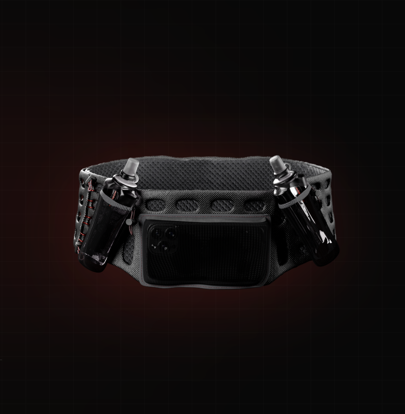
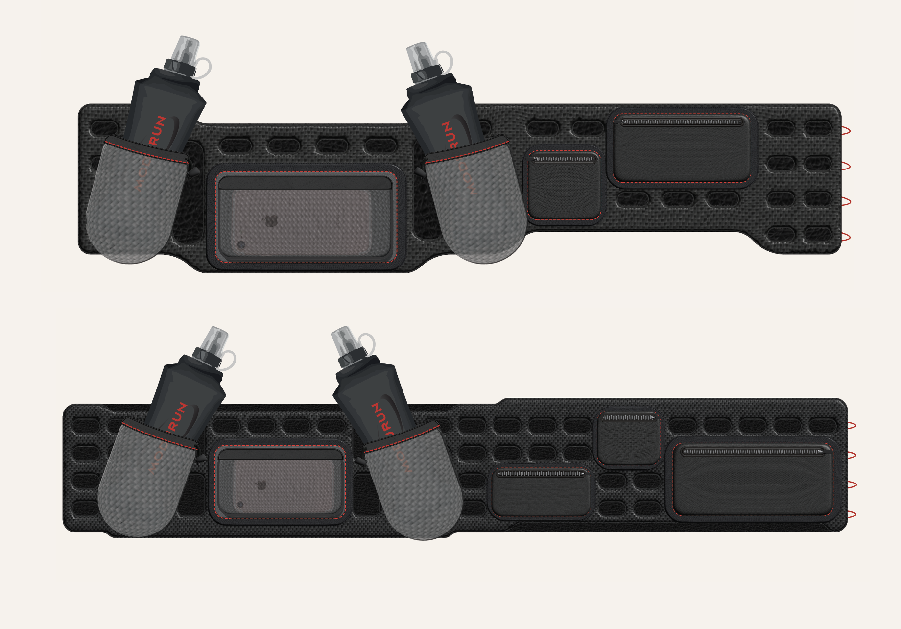
Modurun is a modular running utility belt designed to replace the need for a hydration vest across middle distance runs of 30km or more. Developed in response to a live industry brief, the concept is rooted in extensive primary research and biomechanical analysis, addressing the core failures of existing products, from elastic belts that ride up due to load induced tension loss, to front-heavy designs that compromise natural movement.
The solution centres on a minimal, anatomically tapered belt chassis that follows the iliac crest, paired with an interchangeable module system allowing users to configure and reposition pouches, phone pockets, key compartments, and soft flask water bottles to suit their individual running styles.
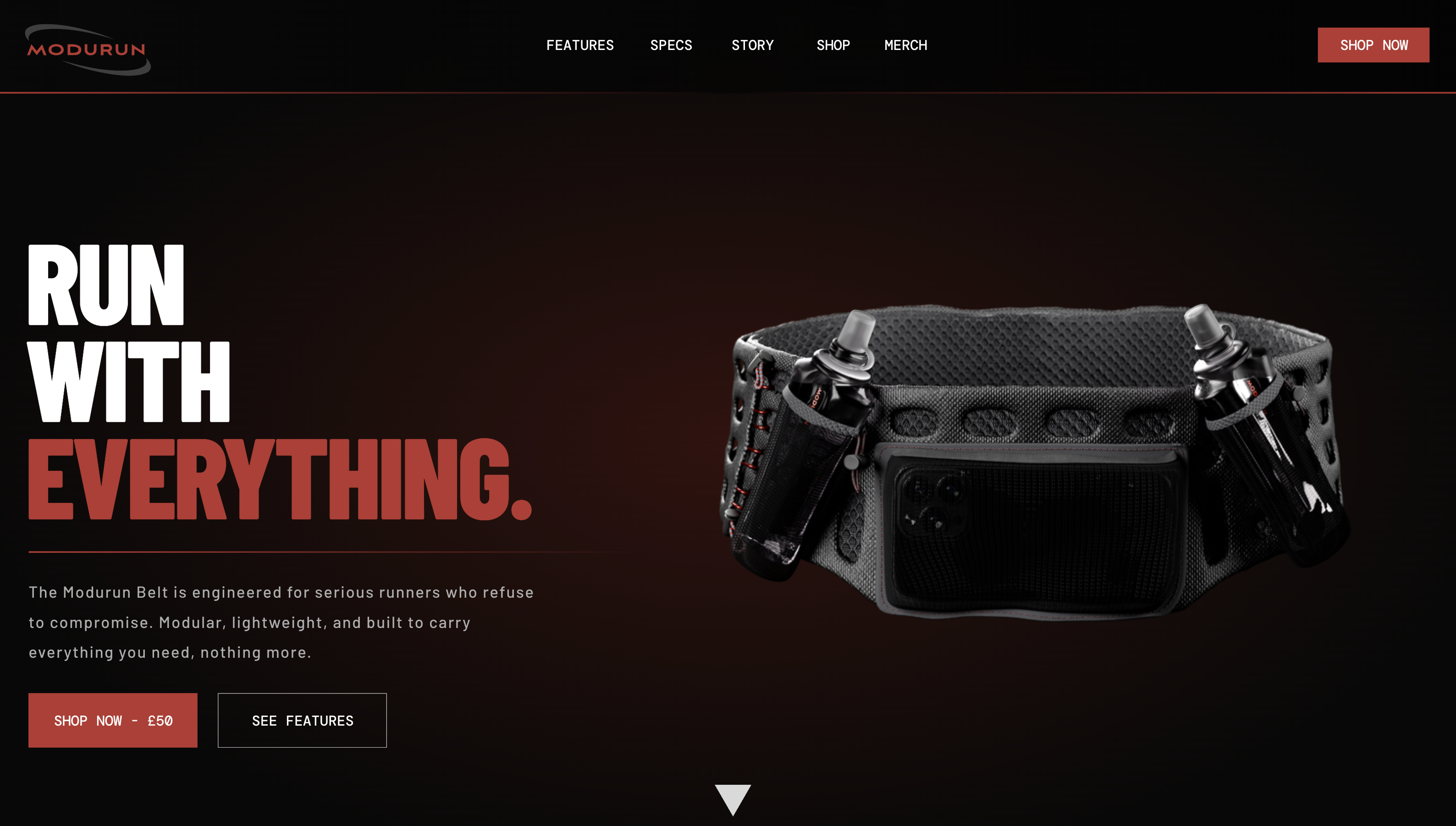
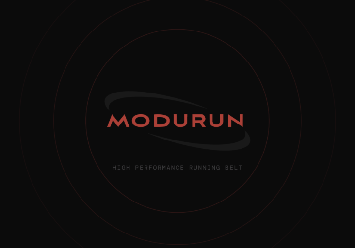
The Modurun brand identity is built around a black and red palette that communicates performance and precision without resorting to the oversaturated aesthetic common to current athletic gear. The logotype, derived from a custom modification of Aviano Sans and encircled by a ring motif that directly references the belt's form, the mark doesn't just name the product, it describes it. The concept demonstrates both commercial viability and a rigorous design process from user insight through to brand identity.
Blockade
Game Design / UI/UX / Branding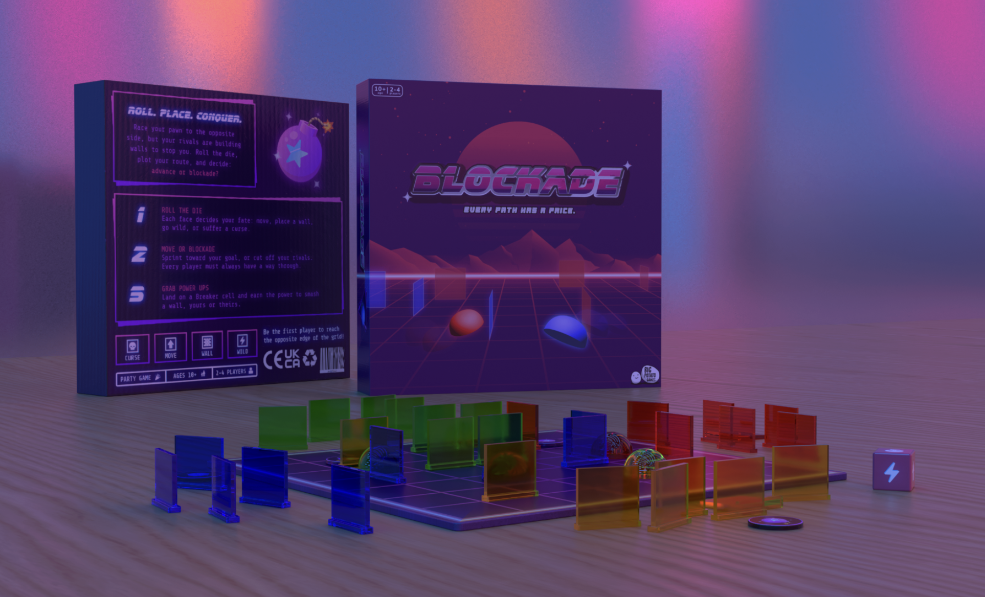
Blockade is a 2–4 player abstract strategy game played on a 7×7 grid in which each player races their pawn to the opposite edge while using a limited supply of acrylic wall pieces to obstruct their opponents routes. The game is driven by a custom six sided die whose face distribution creates a deliberate tension between progress and disruption: move faces and wall faces appear with equal probability, ensuring neither aggression nor advancement dominates, while the curse face introduces an element of calculated risk by removing one of the active player's own walls, and the wild face functions as the game's primary decision point, offering the choice to move, place a wall, or expend a collected bomb token to destroy any wall on the board.
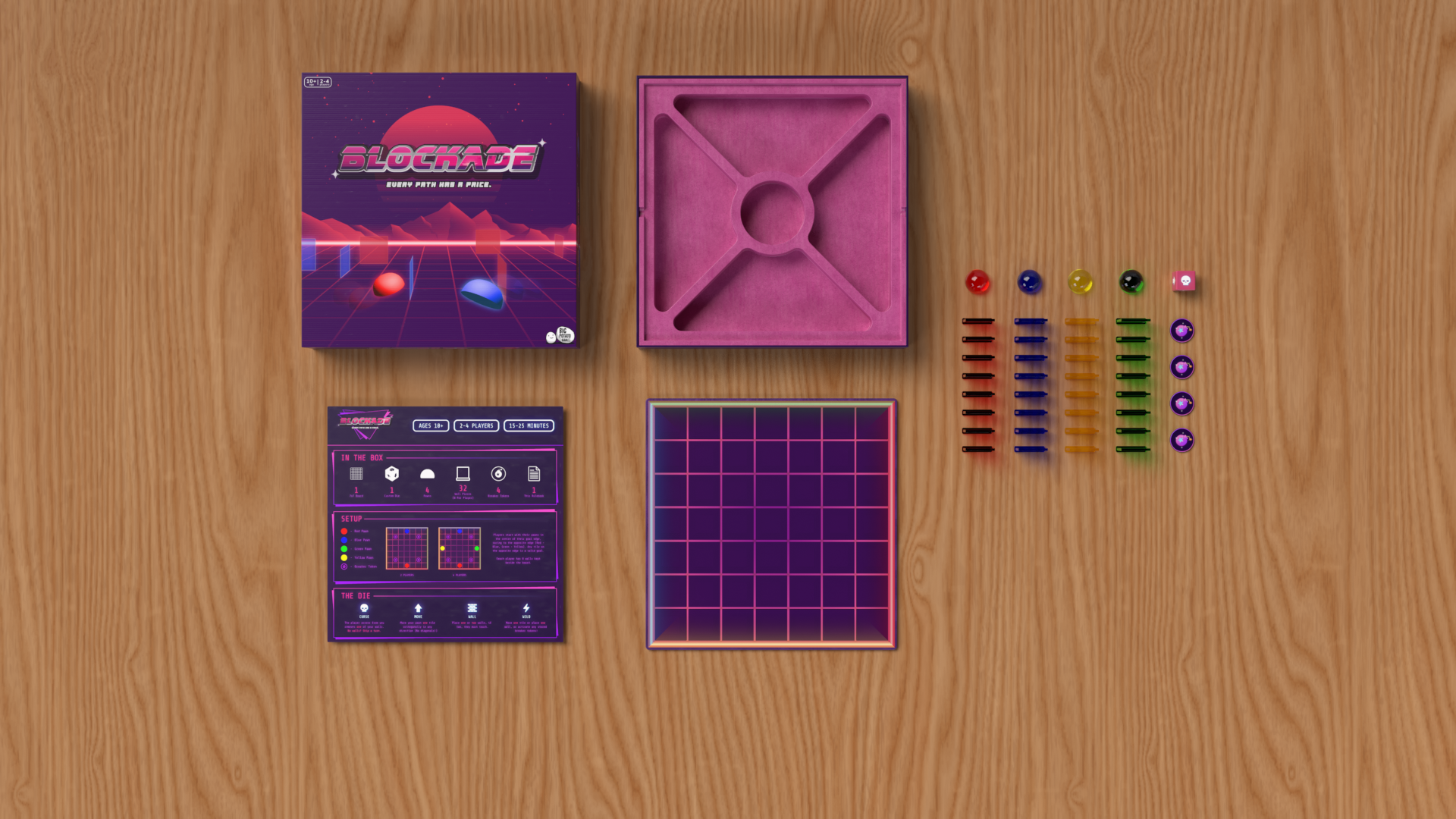
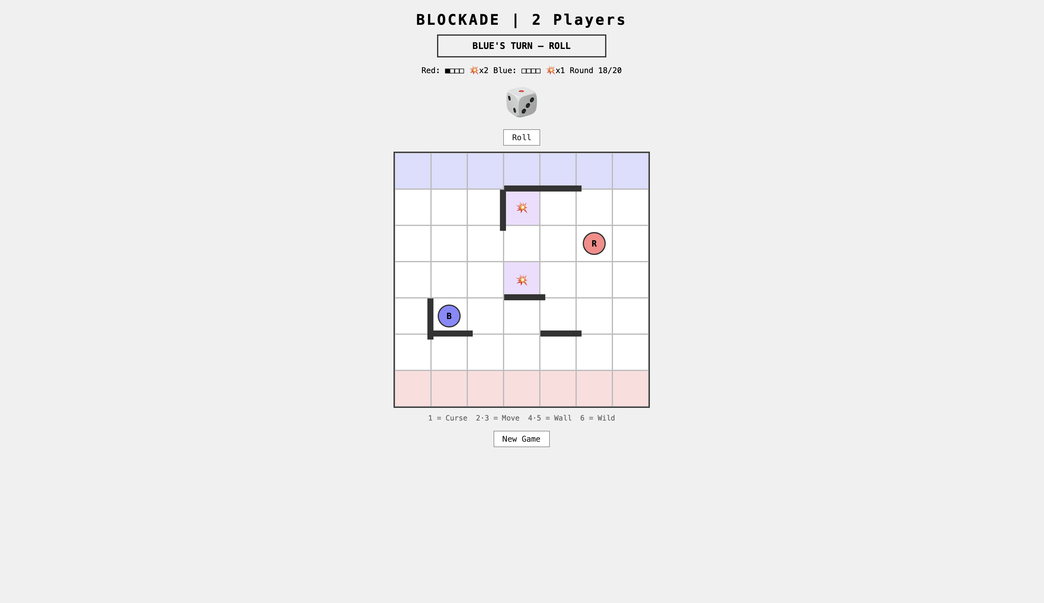
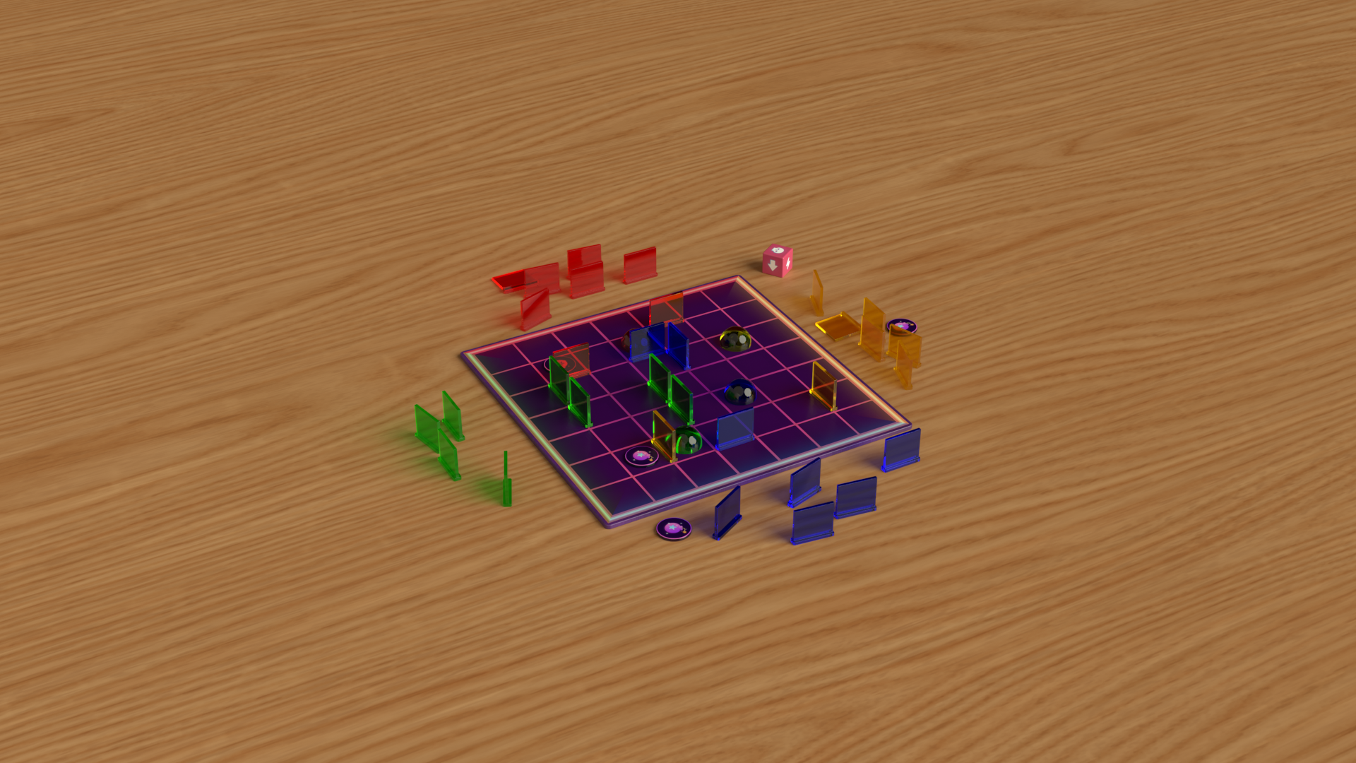
Wall placement follows a path-guarantee rule, to ensure a valid route to goal always exists for every player. A digital rendition of the game was developed in HTML to allow for in depth simulations and playtesting. Blockade was developed as part of a university brief in collaboration with Big Potato Games.
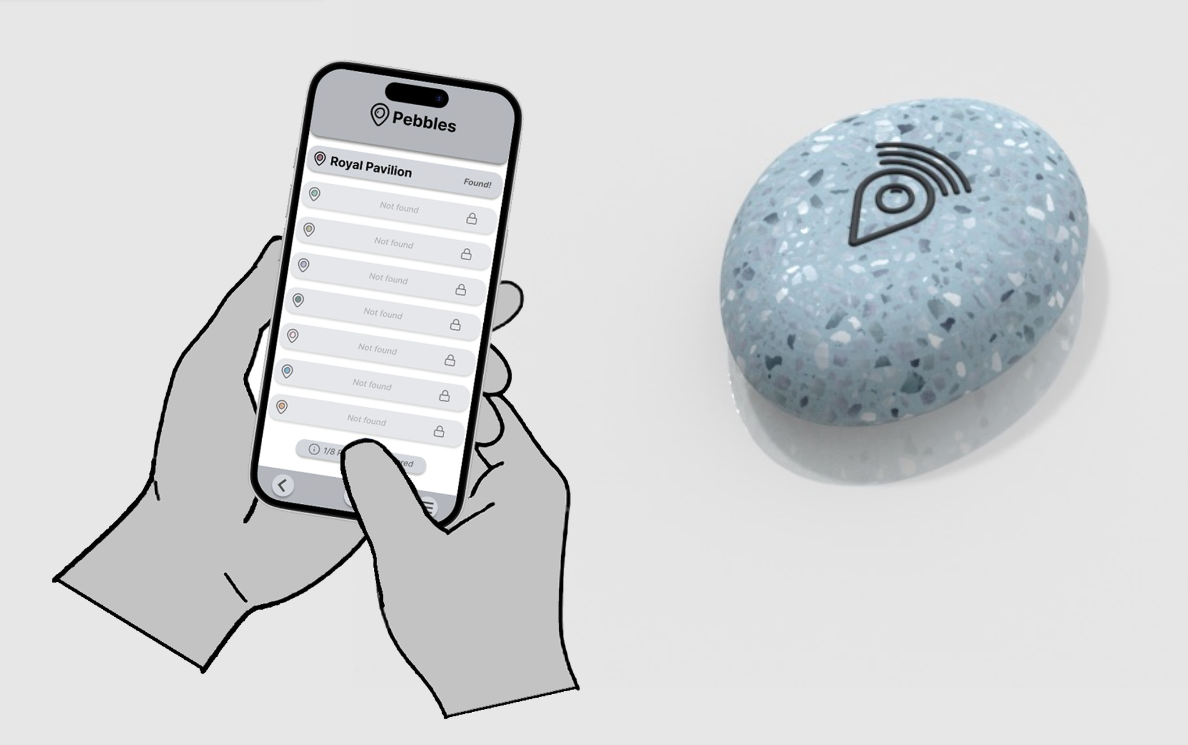
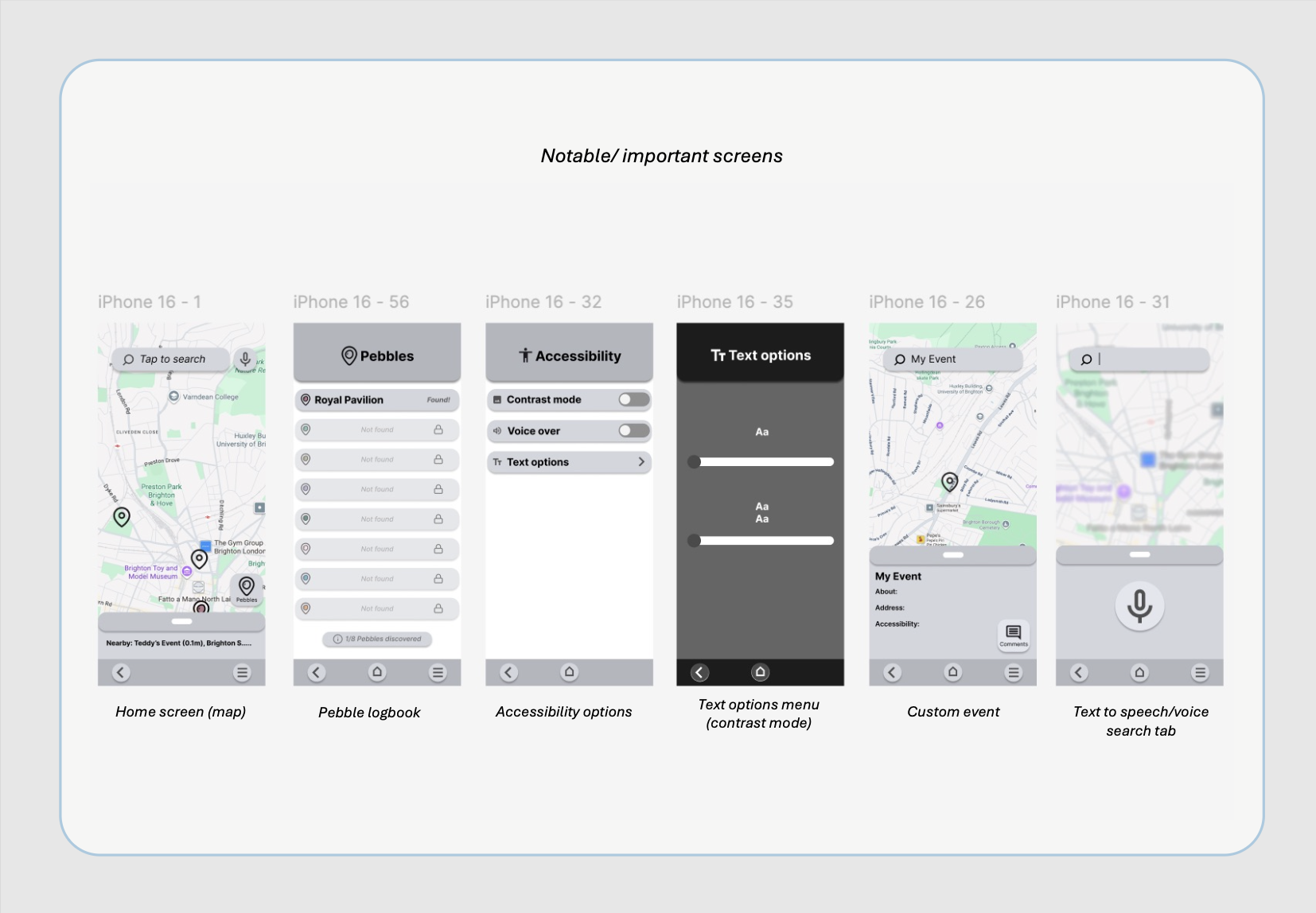
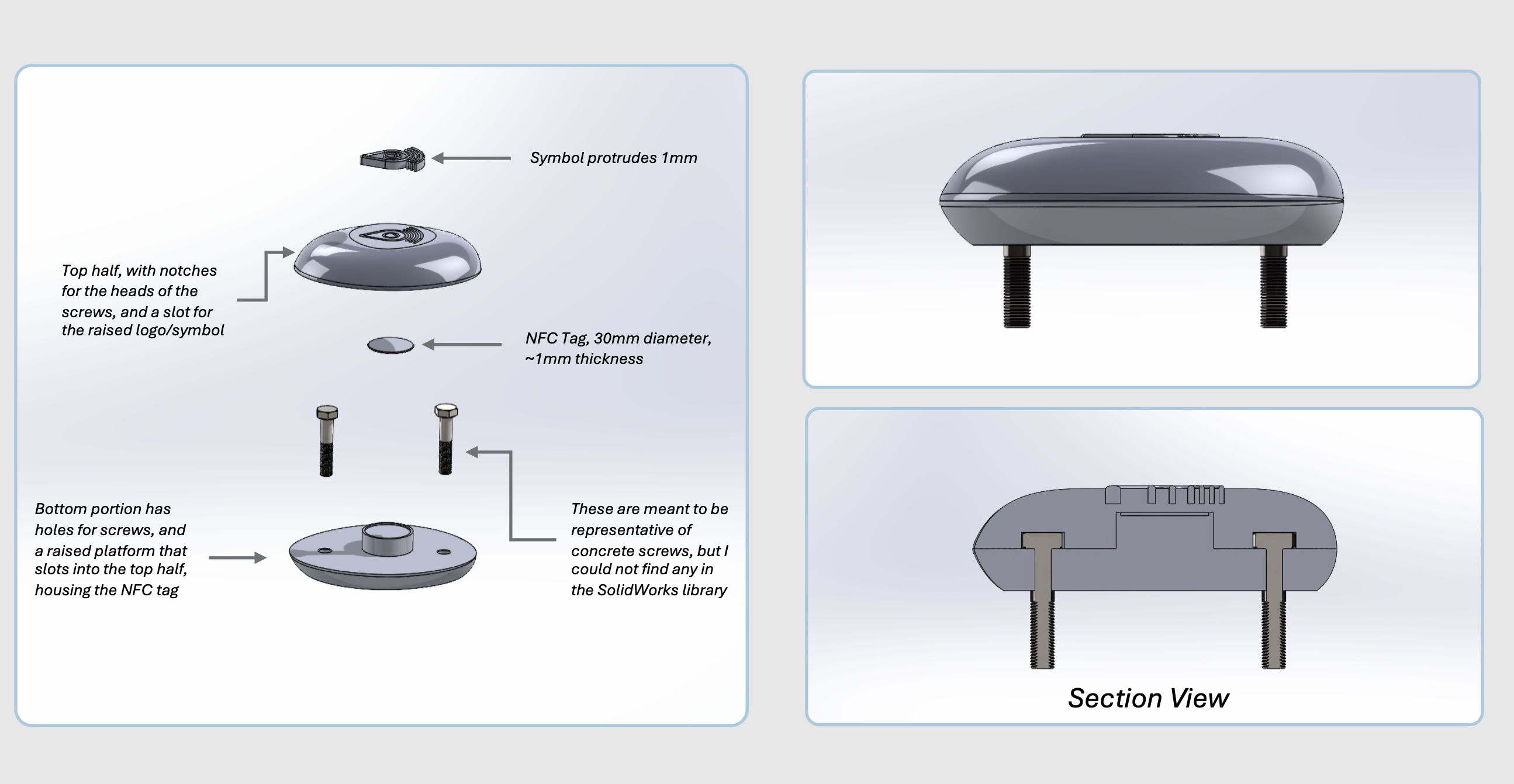
Pebble
UX / Human Factors / Accessibility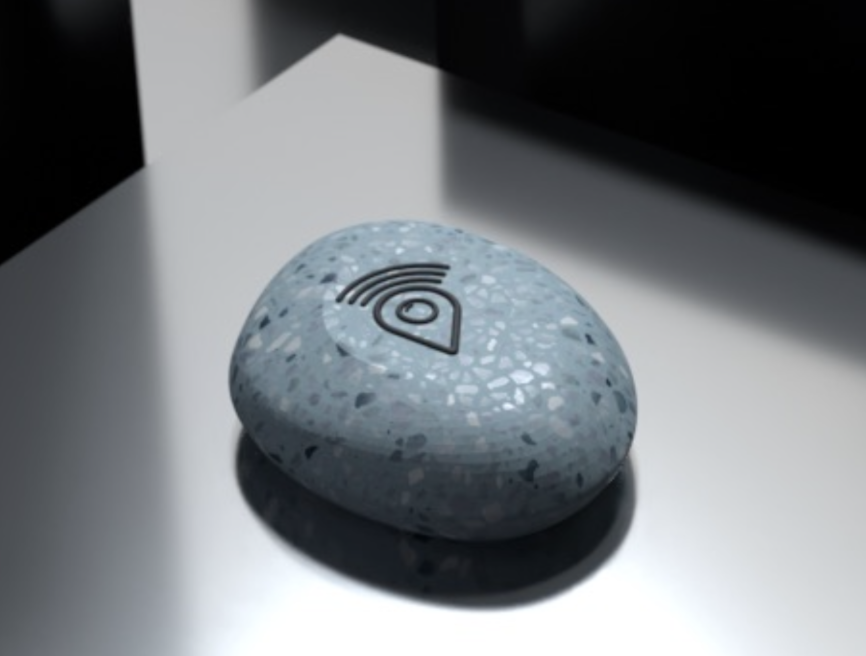
Pebble is a hybrid social discovery platform combining a community led event map with a network of physical NFC touchpoints, designed to help newcomers integrate into Brighton's social landscape. The project targets neurodivergent young adults through the curb cut effect: designing for one particular group, but benefitting all.
The physical component is a terrazzo NFC pebble mounted at accessible heights around Brighton landmarks. Users tap their phone to collect them, triggering a gamified reward system within the companion app. The app features a cool grey and aqua palette chosen to minimise sensory triggers, alongside toggleable accessibility settings and carefully integrated transitions.
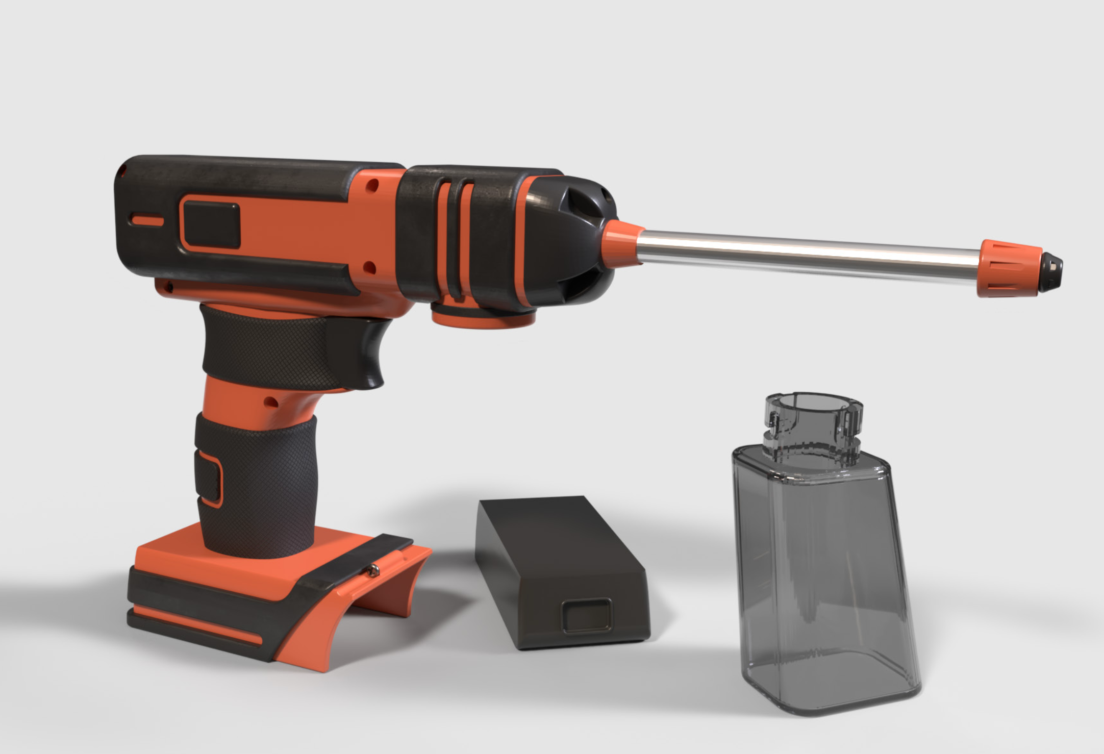
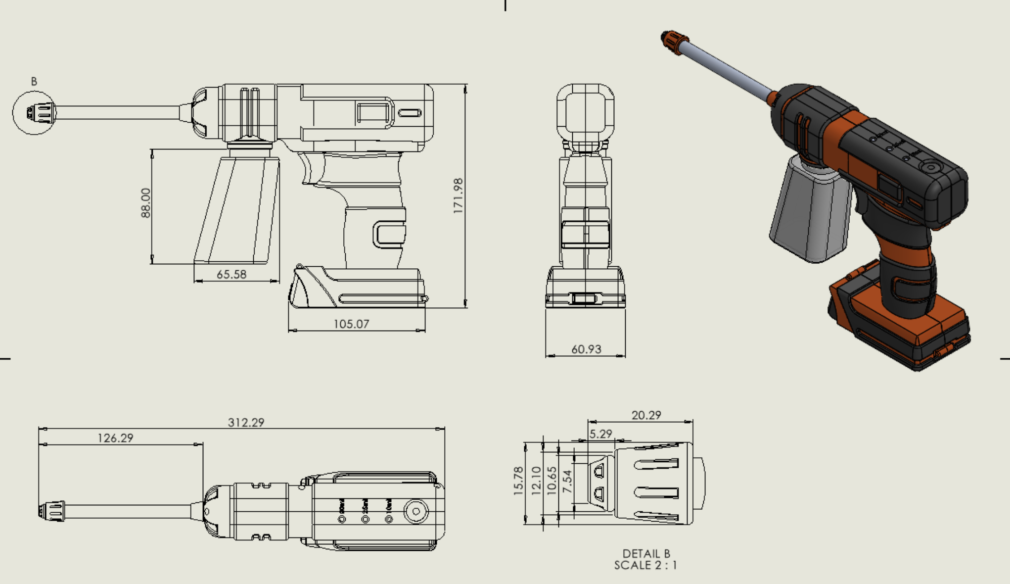
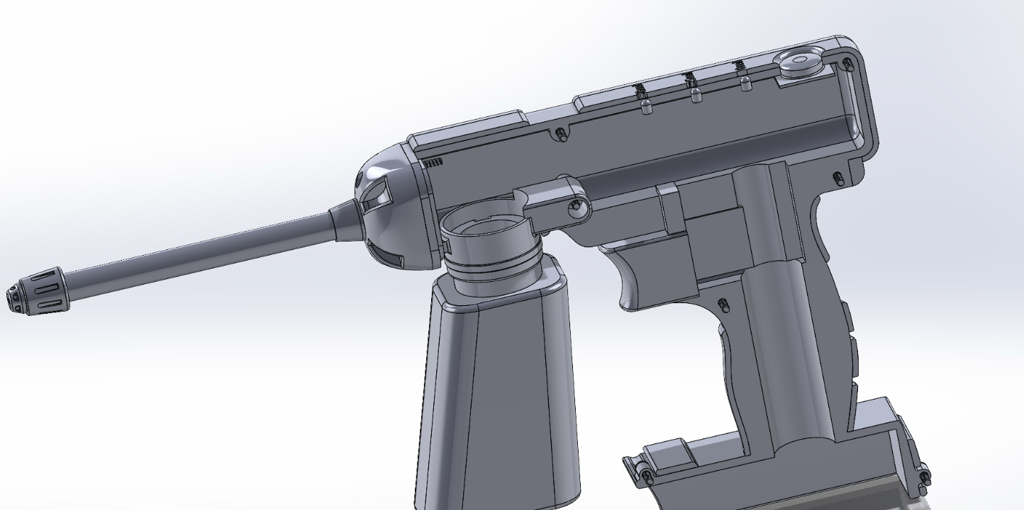
GrowOp
Ergonomics / Design For Manufacture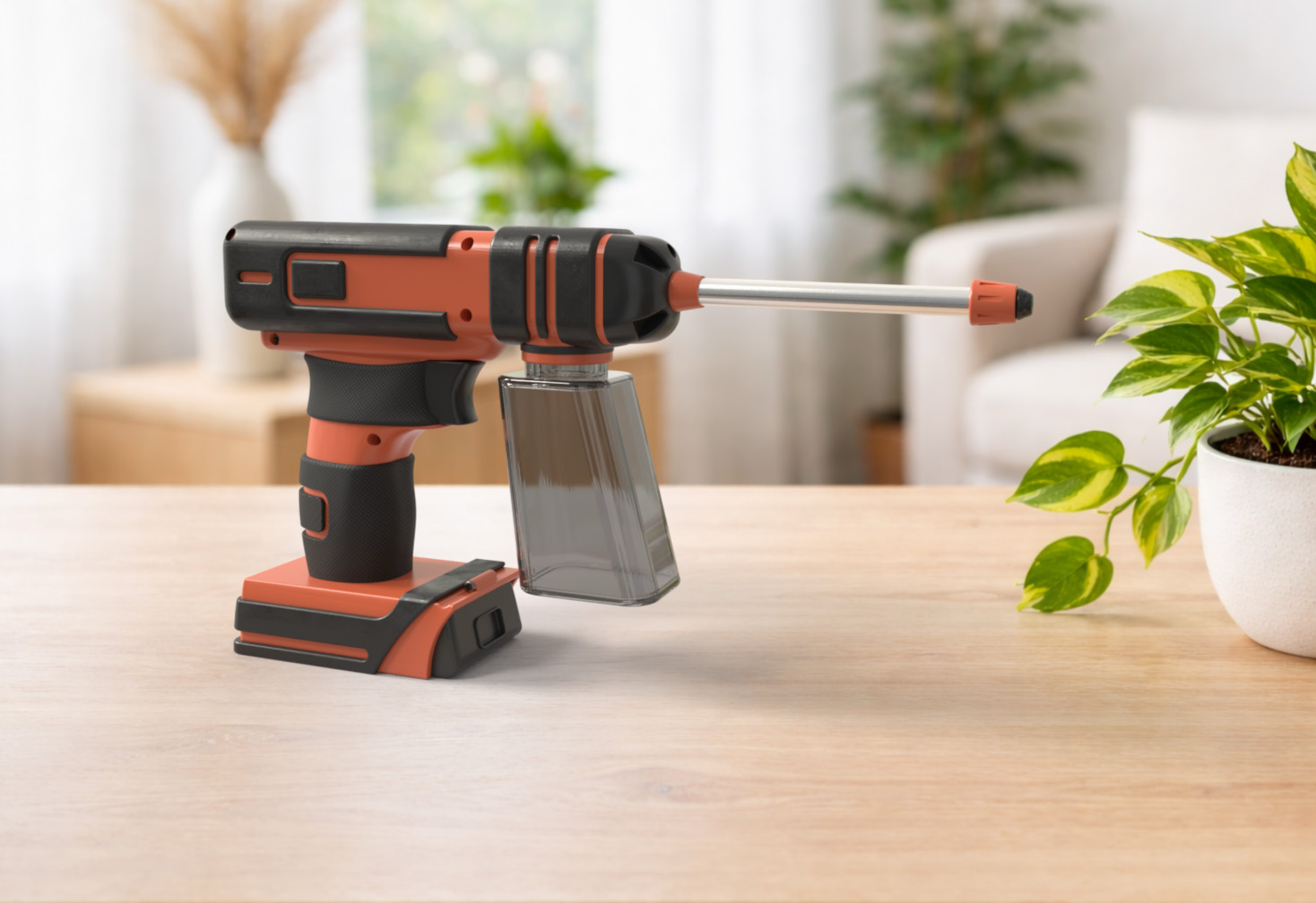
GrowOp is a precision indoor plant watering tool designed for Stanley Black & Decker, developed in response to a live industry brief. Research identified over and under watering as the primary pain point among young urban plant owners, informing a cordless pistol grip device that delivers measured doses of water through a dual mist and spray nozzle.
Three rounds of plasticine prototyping and structured user interviews guided the distribution of the motor, water reservoir, and battery pack to minimise wrist strain. Material specification in ABS, TPR, and carbon steel was driven by design for manufacture principles throughout, with a 3D printed bottle mechanism produced to verify the bayonet attachment system.
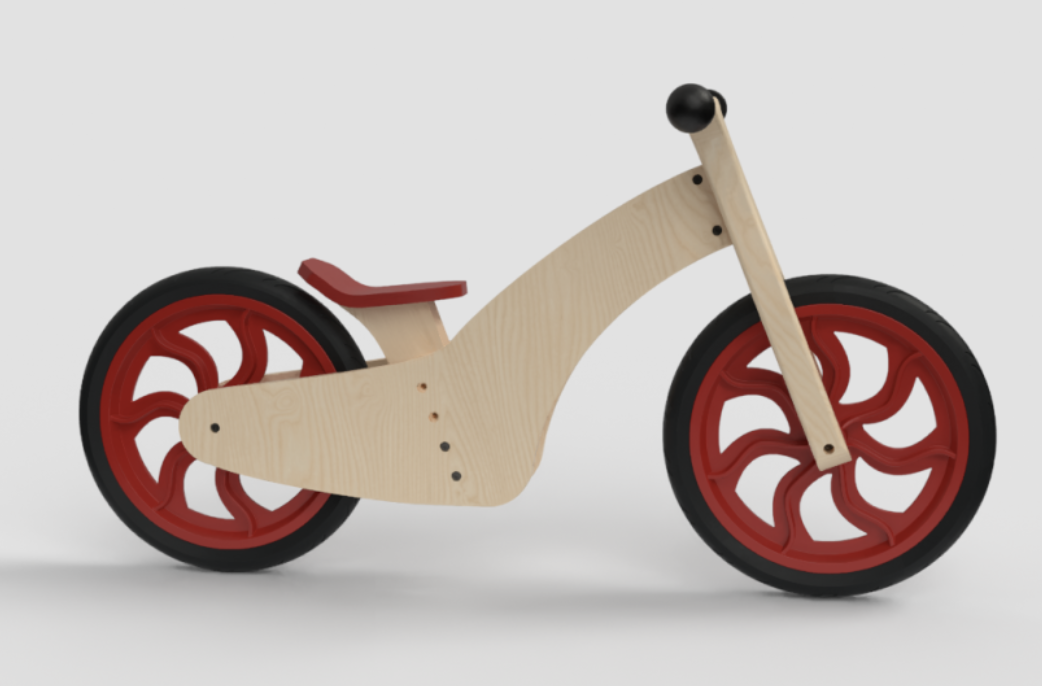
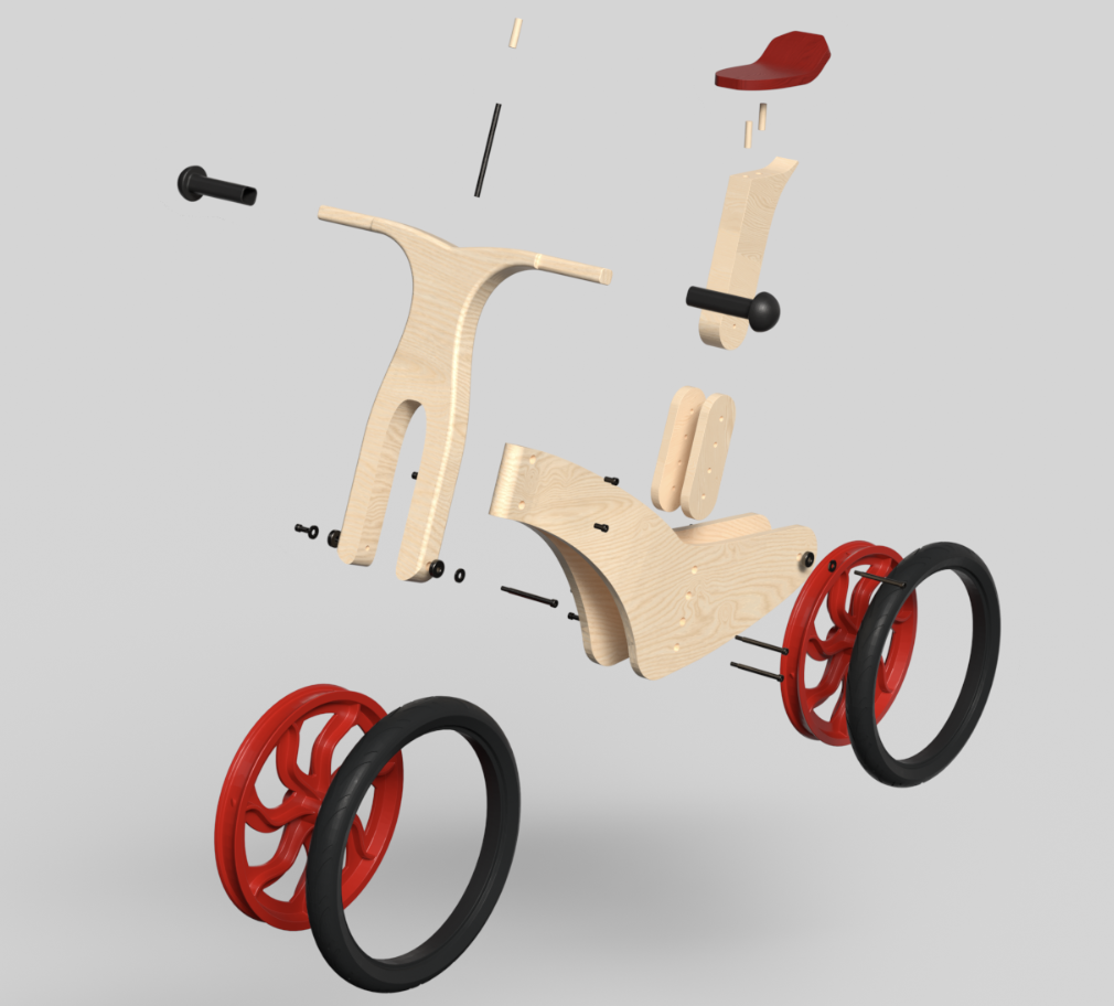
Balance Bike
Design for Manufacture / Ergonomics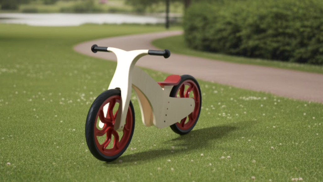
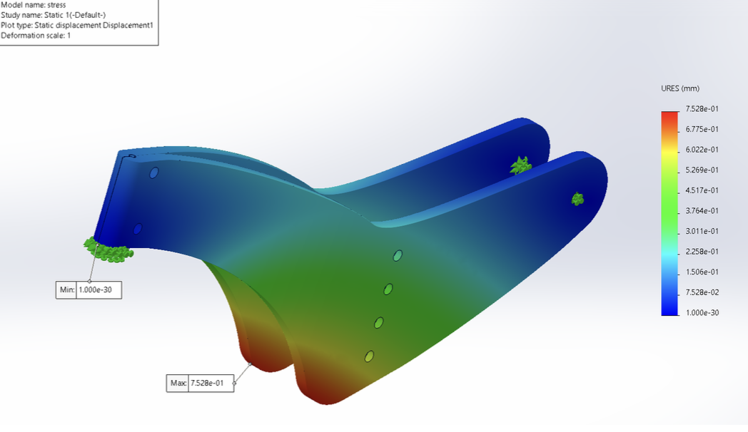
This Design for Manufacture project involved the complete disassembly and efficiency analysis of a children's balance bike, followed by the design of an improved alternative guided entirely by that analysis. Using the Lucas Hull method, the original Janod Bikloon was assessed at just 59% design efficiency across 60 total parts.
The redesigned bike reduces the part count to 35, consolidates plywood to two thicknesses, replaces the multi material stapled seat with a steam-bent plywood alternative, and standardises all assembly to a single Allen key. SolidWorks Simulation stress testing validated the 12mm birch plywood frame under a 294N load, and jackknife prevention was resolved geometrically limiting rotation to 40° per side.
Fuse
Human Factors / Ergonomics / Design for Manufacture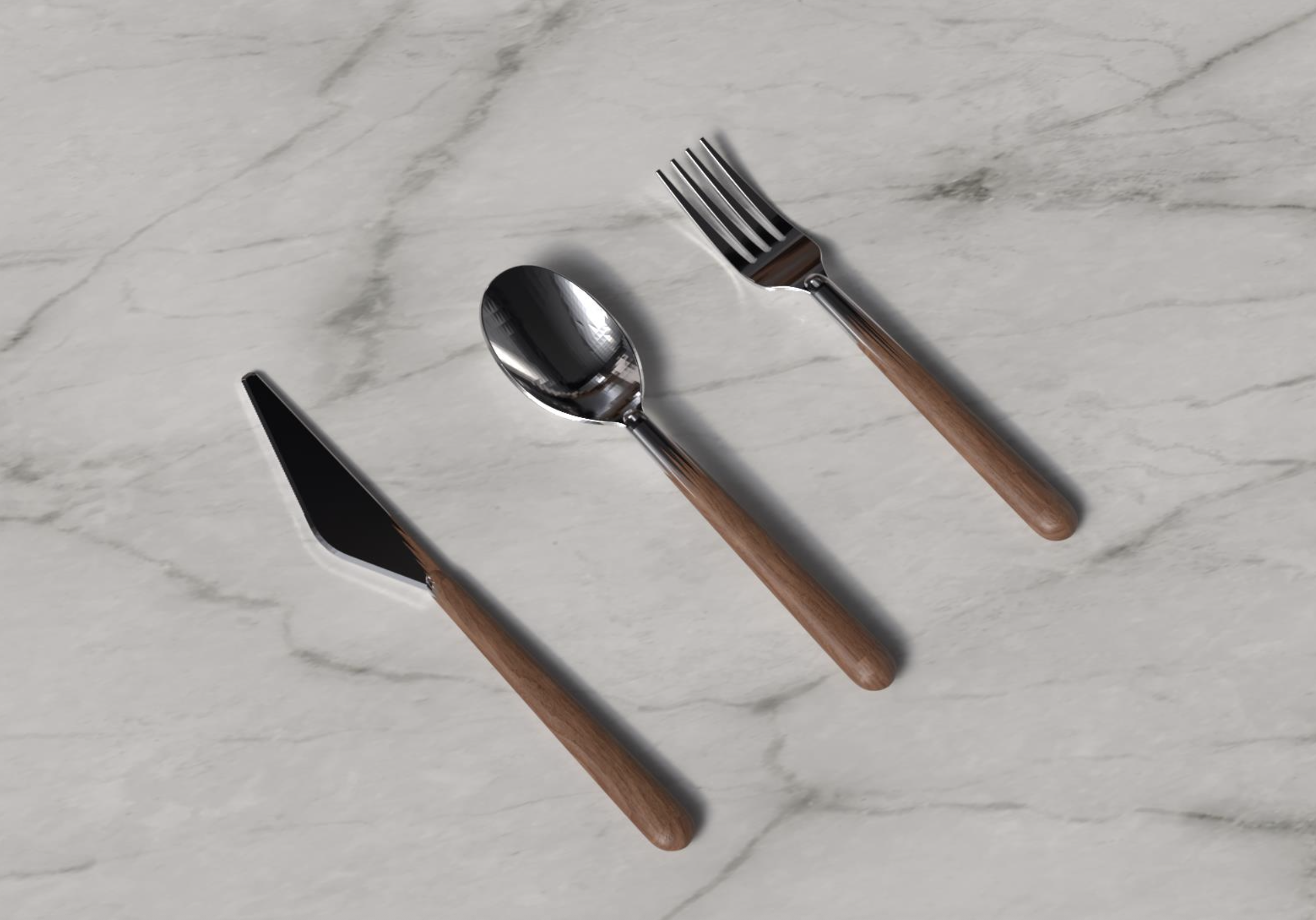
Fuse is a luxury three piece cutlery set developed through a research intensive design process, positioning the everyday dining implement as a considered object of craft and material narrative. Grounded in anthropometric data referenced from Pheasant's Bodyspace against class measurements, the handle geometry, an oval cross-section accommodating approximately 90–95% of the adult population, balances ergonomic rigour with the slender elegance demanded by a luxury market positioning. The set's defining feature is a seamless material morph between polished 316L stainless steel working ends and stabilised walnut handles, joined via an interlocking spike tang and epoxy resin, a concept drawn from a garment that dissolved the boundary between two fundamentally different textiles, and translated here into a tension between industrial precision and organic warmth.
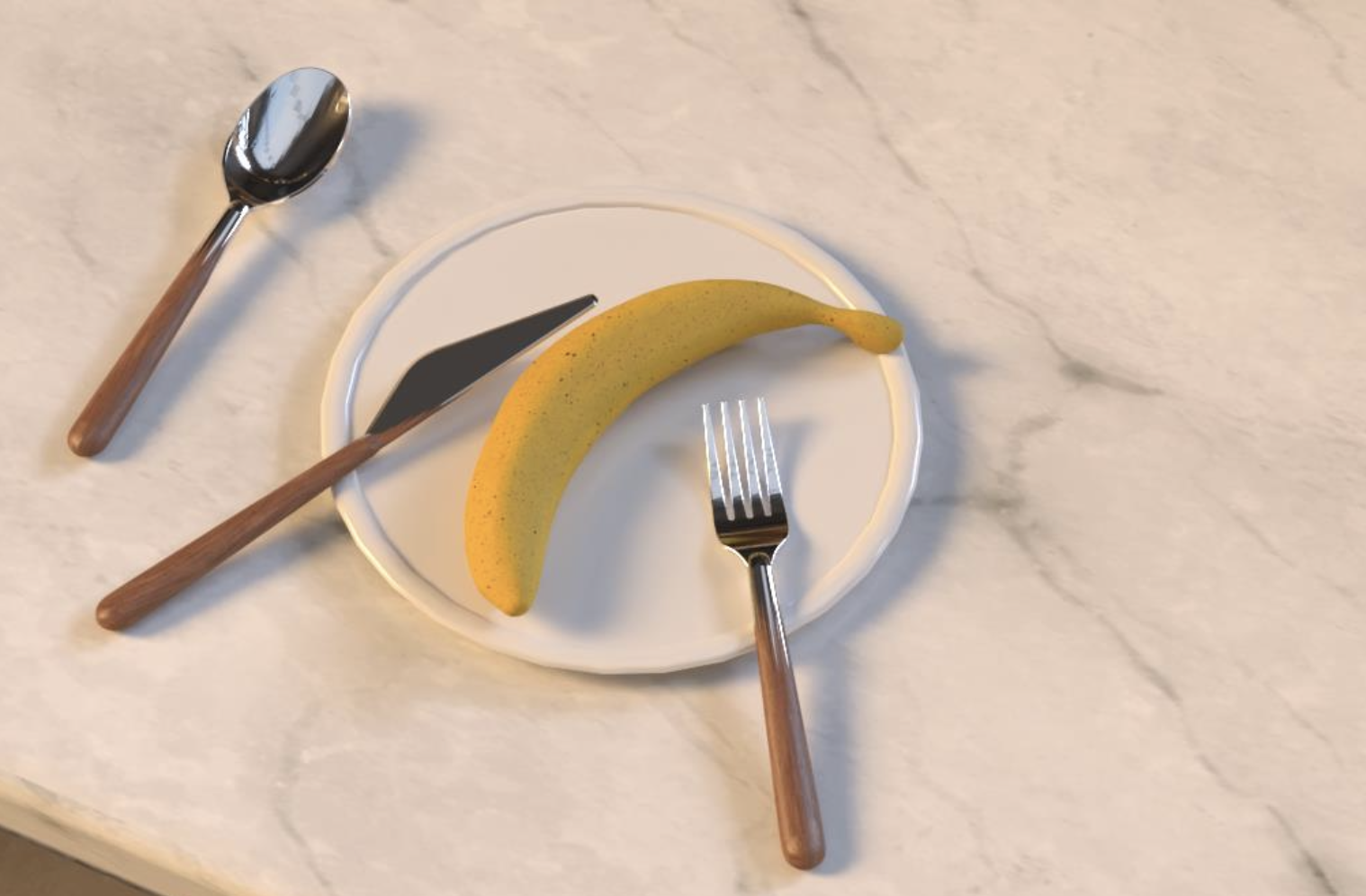
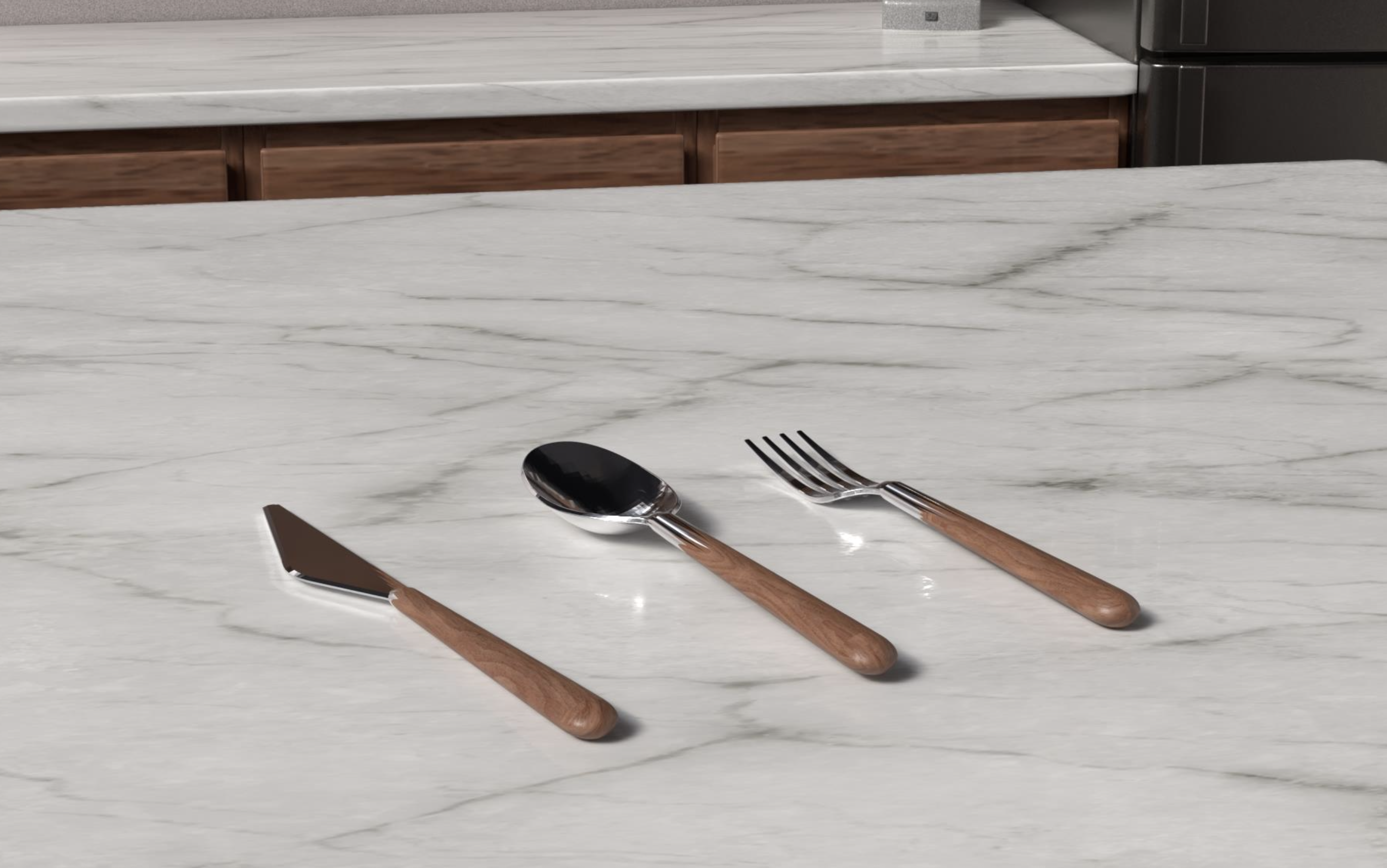
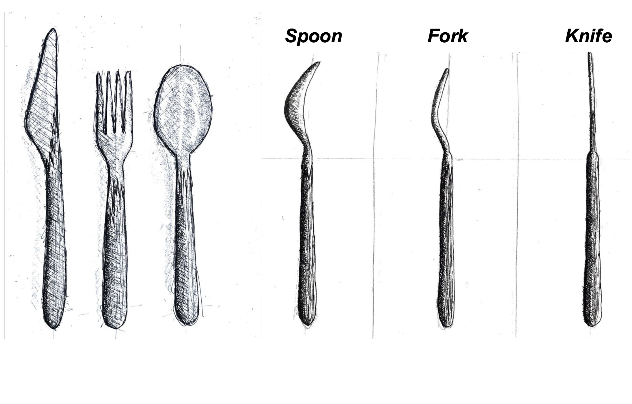
Four iterative prototype generations, from plasticine through to 3D printed PLA, each informed by a consistent panel of user testers, progressively refined the curvature, weight distribution, and handle proportion of all three pieces. Final CAD was produced in SolidWorks and rendered within a custom luxury kitchen environment in Adobe Dimension, contextualising the set within the world of its target user: a design conscious urban professional for whom the objects they live with are as much expressions of identity as they are tools.
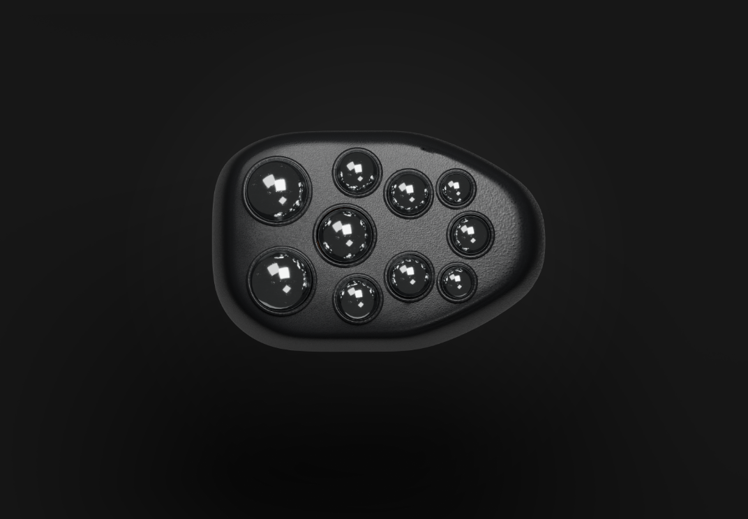
FretKnot
Marketing / Human Factors / Ergonomics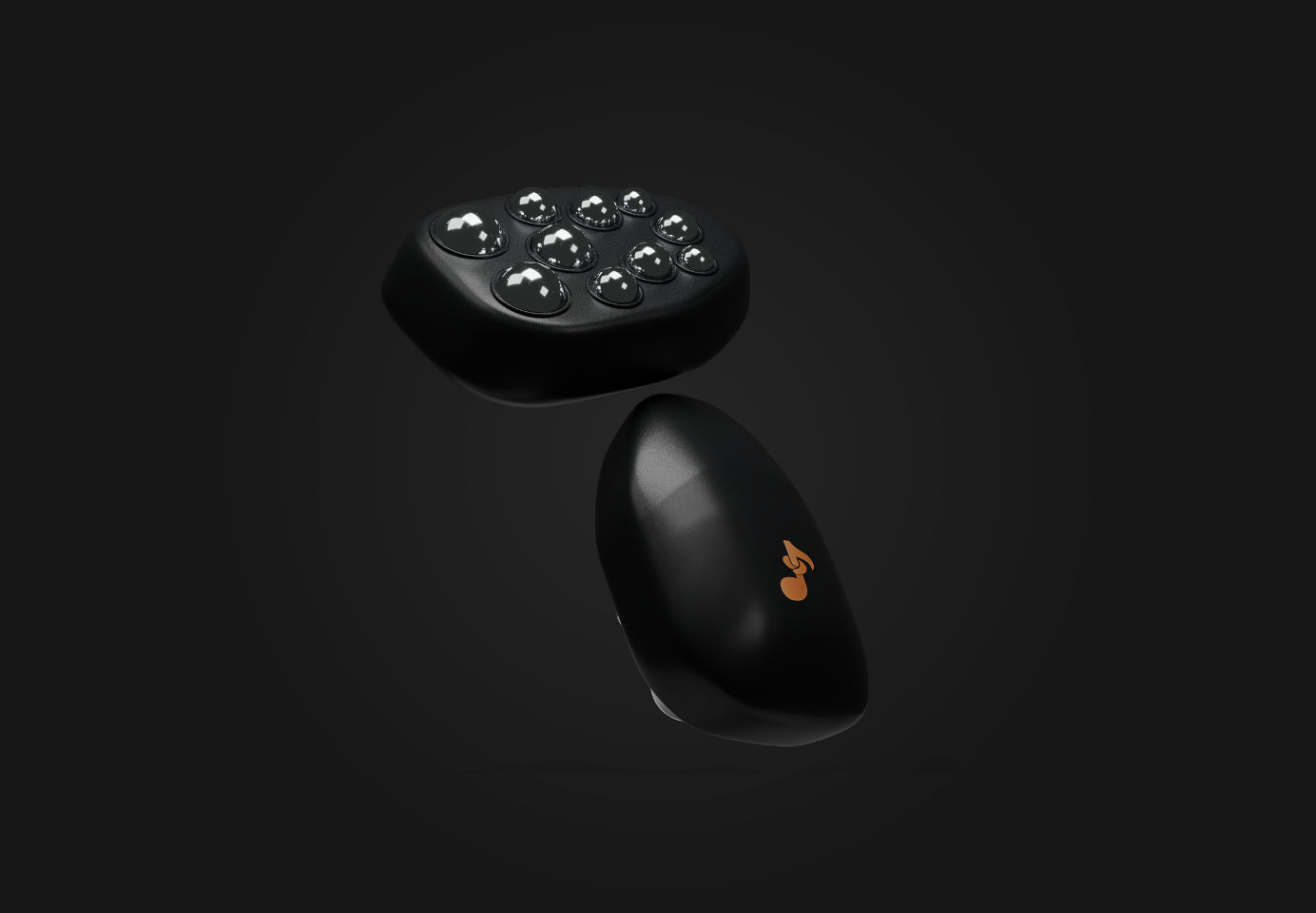
FretKnot is a musician wellness startup and handheld massage tool concept, conceived at the intersection of occupational health research, consumer product design, and brand strategy. The project is grounded in peer-reviewed evidence on playing related musculoskeletal disorders (PRMD), demonstrating that a significant proportion of adult musicians experience career impacting physical injury. This research foundation justifies a release tool targeting the forearms, hands, shoulders, and neck: the muscle groups most commonly compromised by repetitive instrument practice. Designed to be compact enough for a guitar case or bag, it provides accessible muscle care for musicians at every level.
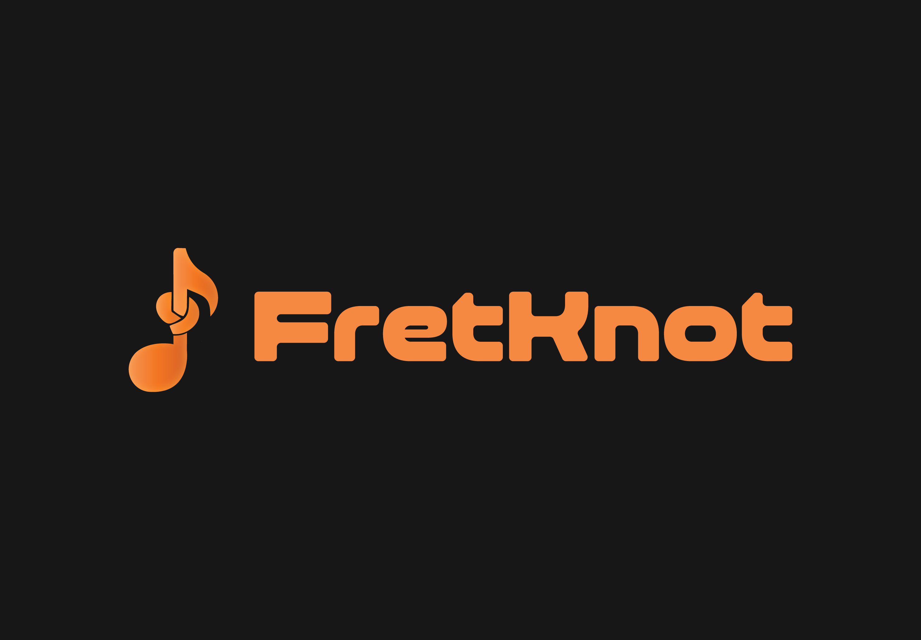
Beyond the physical product, the project includes a fully developed brand identity: FretKnot, expressed with a custom logo in which a music note stem is tied into a knot, a dark visual system anchored with a warm amber, and a tone of voice that balances clinical credibility with accessibility. The project plan was developed to industry standards, covering the full scope of project management knowledge areas, including a work breakdown structure, cost breakdown, risk matrix, stakeholder management, and communication plan, positioning FretKnot as a commercially viable, ethically considered startup ready for market entry.
Shaky City
Game Design / UI/UX / Branding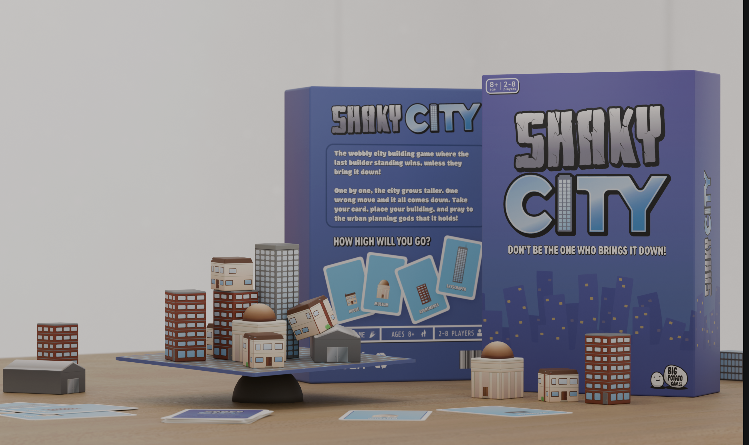
Shaky City is a dexterity based party game developed as part of a collaborative brief with Big Potato Games, positioning physical instability as the central mechanic of a city building experience for 2 to 8 players. The concept tasks players with constructing a shared urban skyline atop an unstable board, placing apartments, offices, and houses in turn while managing the cumulative structural risk of an increasingly precarious cityscape. A deck of action cards introduces an element of choice within each turn, ensuring the game balances chance with decision making.
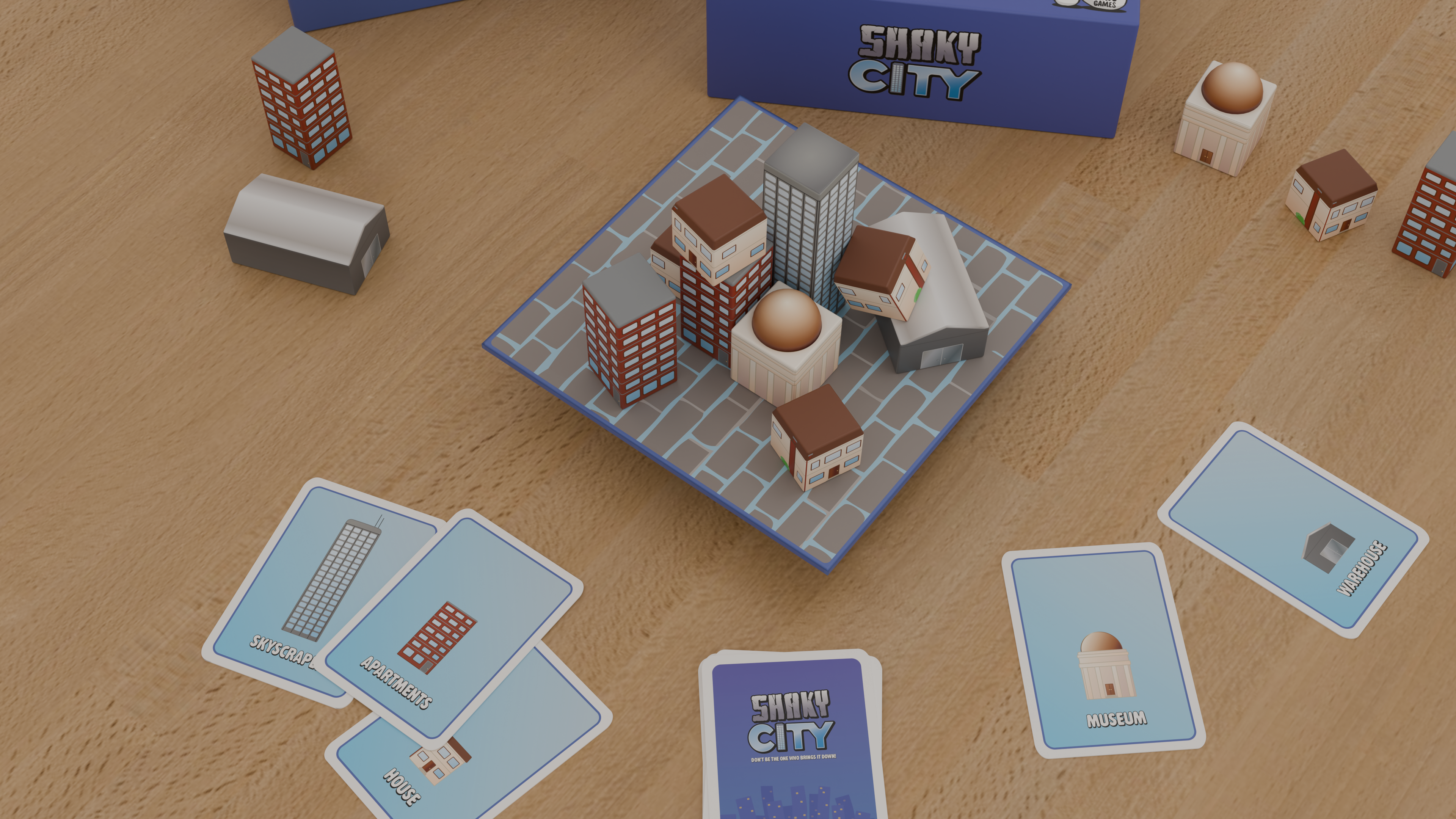
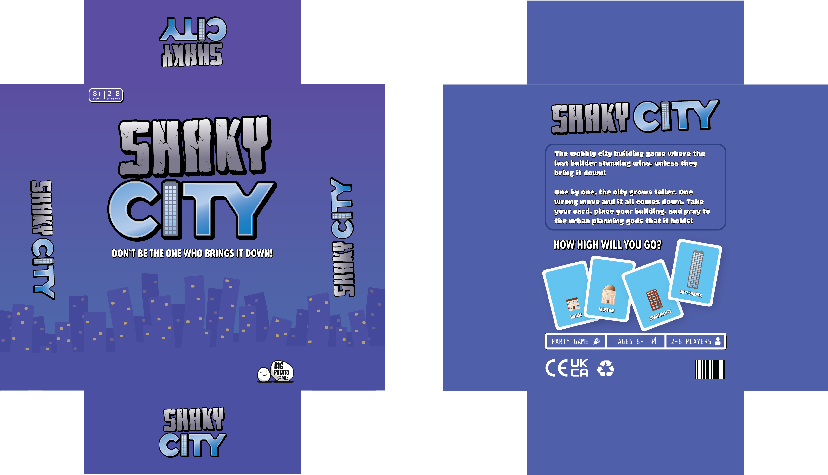
Branding and visual identity were developed in parallel with the physical game system, establishing a bold, graphic aesthetic rooted in Big Potato's style, characterised by bold fonts with intense drop shadow, accessible illustrations, and a tone of voice that balances wit with immediacy. Component design prioritised tactile satisfaction and visual legibility, with building pieces differentiated by silhouette and colour to support quick decision making under pressure. The result is a game that operates fluently within the party segment while delivering a physical play experience with genuine emergent drama.